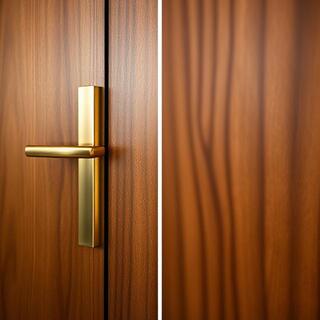
Brass × Walnut
Warm highlight matches walnut’s mid-tones; grain hides small knocks at the handle.
Hardware reads with walls, floors and time of day. Here we put levers and pulls in rooms — you can almost hear the corridors. Each vignette balances grip, visual weight and finish so the first touch feels inevitable, not forced.
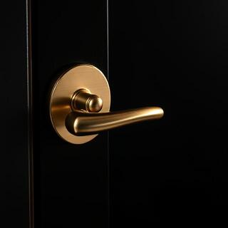

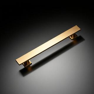
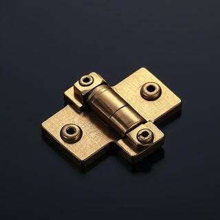
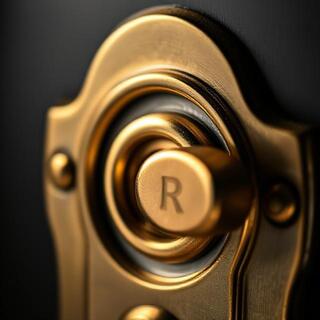
We build rooms around lines rather than dropping handles in at the end. A single finish runs across levers, pulls and hinges; the eye reads one family while the hand keeps the story.
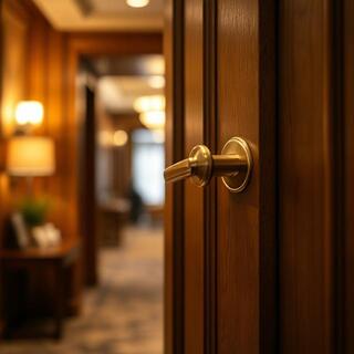
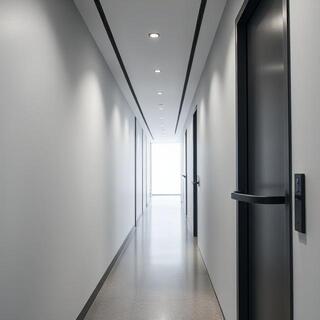
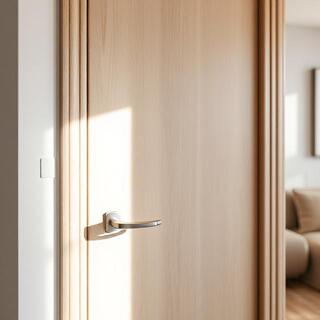
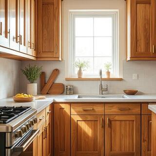
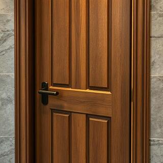
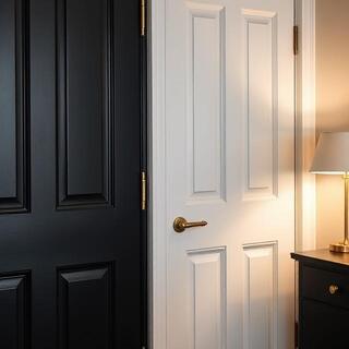
The quickest way to make a building read expensive is to repeat geometry. Our levers share spindles and returns, so grips feel identical across lines. That continuity travels from rooms into memory — visitors recall calm hands and aligned planes.
Choose one finish and let other materials orbit it. Scroll the rail or swipe on mobile — the bar fills as you move through ideas.
Warm highlight matches walnut’s mid-tones; grain hides small knocks at the handle.
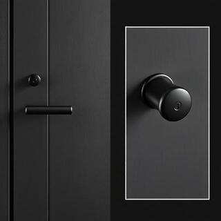
Low-glare black keeps focus on planes; corridors stay clean under strong downlights.
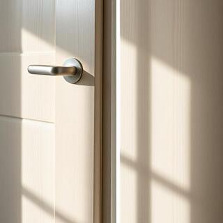
Cool neutrality reads clean next to pale woods and white paints.
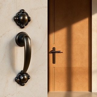
Oil-rubbed depth pairs with chalky stone; wear at edges grows gentle character.
On big projects we tune colour temperature and sheen so the same line behaves across floors: brighter south façades get black or nickel; internal courtyards lean into brass and bronze.
Swap a line or finish and the room settles differently. Slide to compare — sightlines, highlights and fingerprints change with geometry and texture.
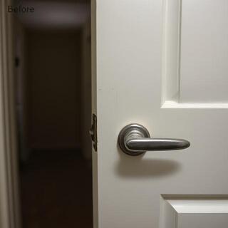
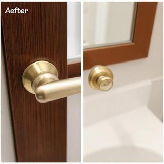
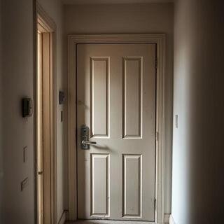
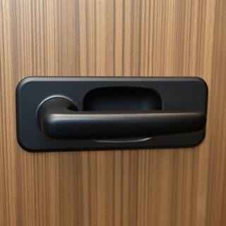
Geometry repeats calm the eye. Brass reads warm on painted planes and hides small knocks along the grain; black disappears in long corridors under LED; satin nickel sits neutral against birch and cool stone. When all grips share one return and edge radius, muscle memory takes over — occupants stop noticing hardware and rooms feel expensive without trying.
Detail the hand first. Edge radii, return springs and rose diameters decide comfort long before a finish is picked. We bias to predictable torque: a light start from latch throw, firm near closure, never gritty. Bushed hinges push this feel into the door — quiet swing, soft landing.
In Indian projects, 60 mm backset keeps fingers clear of wide architraves; longer spindles ship for thicker doors. On hospitality floors, choose a single sheen: brushed brass keeps grace with housekeeping, matte black refuses glare, nickel mirrors timber gently. Pulls echo the lever’s drop so the hand recognises family even off the door.
Daylight picks grain; night lighting pushes specular highlights. Drag the slider — scenes fade from day to night so you can see which finish stays calm in each condition.
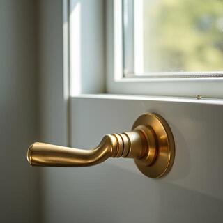

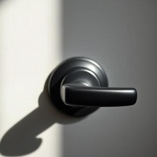

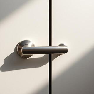
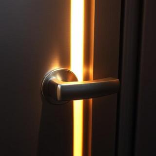
Tune intensity before you pick colour. In bright south-facing rooms, matte black steadies planes; in pale timber apartments, nickel reads fresh; in stone lobbies, brass lifts thresholds. If lights change across floors, we hold the same grip geometry so the hand never has to learn twice.
Three finishes cover most briefs in India. Tap a tab: see the room, then read how it behaves day to night. Bars animate for glare, fingerprint visibility and warmth.
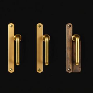
Brass reads premium in lobbies and guest corridors. Directional brushing softens reflections — a warm edge without mirror glare. Keep hinges and pulls in the same sheen so planes stay calm.

Strong downlights can turn doors into mirrors. Black keeps sightlines quiet and hides micro-scratches across long runs. Match door viewers and stops in black — the line reads as one.
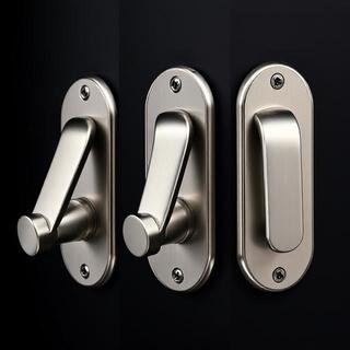
Nickel follows timber gently. Keep cleaning straight and light to avoid swirl marks; the soft sheen stays even across levers, pulls and architectural hinges.
A quiet door feels light at the start and sure near the latch. Drag the slider — we show frames from closed to 60°. The dial fills to match the angle.
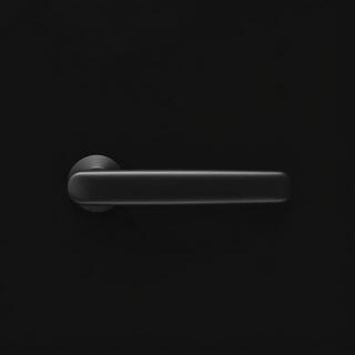
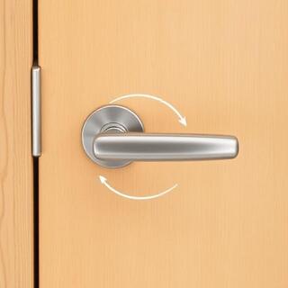

Wider hinge spacing suits heavy leaves; lighter doors prefer tighter spacing and more reach at the lever. Bushed hinges keep the torque smooth so the first pull never feels gritty. That’s what corridors remember.
Two rooms, one intent: the hand meets predictable edges and returns, while light and time give the finish its character.
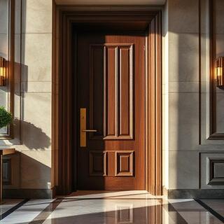
Brushed brass lifts pale stone without shouting. People feel the soft start of travel long before they notice colour; the door lands quiet on felted strikes.
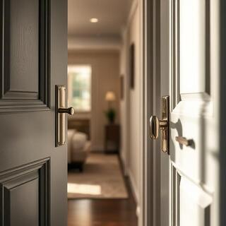
Nickel stays neutral against birch and white paint. The same drop and rose keep muscle memory from room to room, so the building reads expensive without trying.
Tick the items you’ll issue to site. As the list completes, the bar fills and the spec note is ready to copy straight into a BOQ or a sheet.
This pack keeps drawings lean: installers open a flat-numbered box and fit the same geometry everywhere. Hinges are colour-matched; felted strikes calm first weeks of closing.
Where does the hand travel? We map the sequence. Press play — nodes glow in order; repeat shows how consistent geometry makes the building feel “learned”.
Repeating the same drop, return and rose keeps muscle memory intact. Guests stop “finding” handles and start reading the room instead — corridors feel calm, not busy.
Light angle and intensity decide how loud a handle looks at night. Move the sliders — the panel simulates a beam across a door plane and reports a simple “glare risk”.
Glare risk: Low — brass warms, black stays calm, nickel remains neutral at this setting.
We tune finish to light, not to trend. If a corridor runs hard LEDs, black is your friend; in pale timber apartments nickel feels clean; brass lifts stone thresholds without mirror shine.
Rooms read expensive when edges, returns and sheens repeat. Two small frames show how grain and light carry the story before colour does.
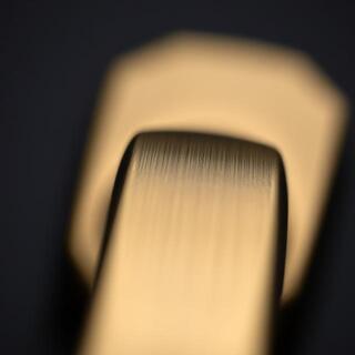
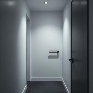
We keep one geometry across levers, pulls and hinges so the hand learns once. Finishes then tune the room: warm brass at thresholds, black for disciplined corridors, nickel for calm apartments with pale woods.
Bushed hinges and felted strikes cut the first weeks of clang. We log torque and cycle counts, then tune spacing for heavy leaves so the first pull feels inevitable, not forced.
On hospitality floors we repeat the same drop and return — guests stop “finding” handles and start reading the room. That’s how corridors remember calm.
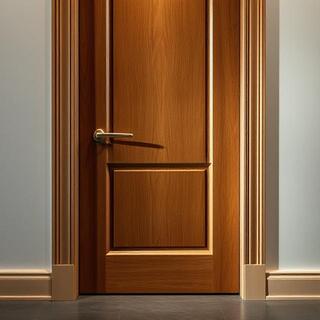
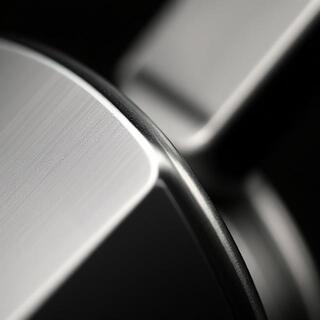
Edge radius and brushing decide comfort before finish does. Move the lens to inspect — grain direction and soft arrises keep touch predictable.
We bias to predictable torque: light at start, sure near the latch. Bushed hinges push that feel into the door — quiet swing, soft return. For Indian projects, 60 mm backset clears wide architraves.